It's time to start applying some design to this
I've had a rough picture in my head for a while but I'm going straight to code with this so I've never put anything on "paper". What I'm picturing (and this is my entire design brief at this point) is something like a Calder sculpture—simple geometric shapes but with rounded corners, simple primary colors, and some sort of motion. My day job involves nothing but blue and square corners, so whatever it is it has to be a break from that.
Then CSS Tricks posted this:
https://css-tricks.com/spotting-a-trend/
So I'm not the only one I guess!? Despite the danger of looking like I'm following a trend (kidding), I'm sticking with it.
For the motion I'm thinking probably scroll-triggered using Greensock's new ScrollTrigger plugin. I haven't used Greensock in a while and I'm looking forward to it, it's always been my favorite library from my Flash days and I just haven't had too much call for it with Javascript. Nothing directly mouse-related to avoid accessibility and mobile device issues.
But first, fonts
First rule is no Roboto. I don't actually have a problem with it—it's got a lot of weight options, it's super readable and very "clean", but it's all I get to use at work and there's so much more out there.
Second rule is that I'm not going to spend a lot of time on this. There are so many options out there and I don't want to get sidetracked. I'm going to do some research, pick a few options to try out, and go with one. I can always try it later.
My first thought was a big heavy serif font for headlines with something contrasting for the body. I reviewed a bunch of options for both and so far haven't settled on anything final yet. Being available on Google fonts would be nice but is not a requirement. The title font would work with the Calder idea, whatever that means—I'll know it when I see it.
For the body, Inter is very interesting. It's got a ton of weight options, lots of advanced font features, LOTS of attention to typography details (it pushes all of my type nerd buttons) and is available on Google Fonts. It's not very exciting though (maybe a little too similar to Roboto?), and I've been watching Jason Pamental's Moby Dick project and really liking the serifs when shown on hi-dpi displays.
For the titles I've been looking at Young Serif. It's only available in one weight but for titles that's OK. It just feels energetic and positive despite being so heavy. Some of the specific letterforms, like the "e" and "o", have really nice touches, and it has oldstyle figures (type nerd again). I'm not as sure about it at small sizes though, it gets a little dense, so I'd need to keep the titles pretty large or use something else for things that I might have used it for like buttons.
Since my days in college painting letters by hand in guache I've had a thing for older fonts (and again maybe this is the Moby Dick project influencing me). EB Garamond might be a good option both for titles and body, with the plus that it's a variable font so one font could cover multiple weights and italics with one font file.
So probably one of those combinations.
Variable Fonts
I'm really interested in where this is going but so far the things that "vary" in these seem mostly unnecessary (like do we really need infinite weights?) or very gimmicky (how "serifed" a font is?).
Although my font design experience is limited to a few experiments a long time ago, I wonder how type designers will handle this given how much hands-on detail is usually required—seems like it will be a big switch to a mindset where you're defining rules that influence a design rather than having direct control over it. It's probably a lot like what web designers had to go through with the switch to responsive design 10 years ago, or image art direction more recently.
Thankfully I'm not worrying about Internet Explorer here like I have to at work, but until it's truly supported by all other browsers I'm not sure I'm ready to commit. If I do go with a single font, probably EB Garamond, I might use it as long as I can also implement a non-variable fallback without too much trouble. I do see how it can help with performance in that case.
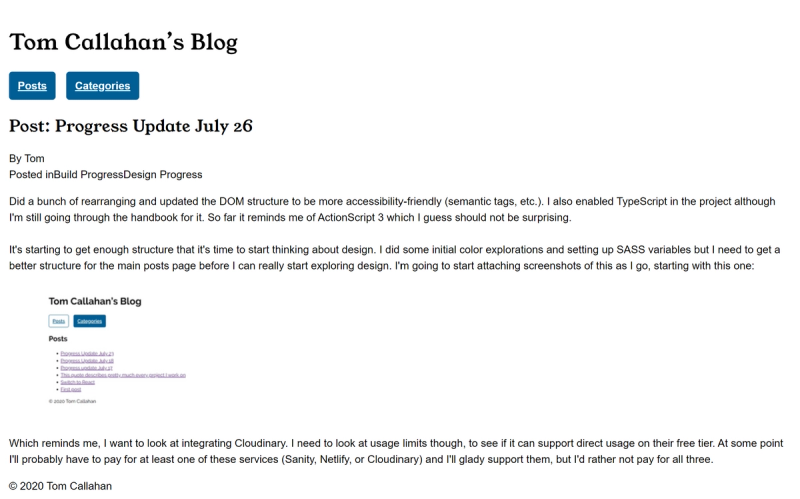
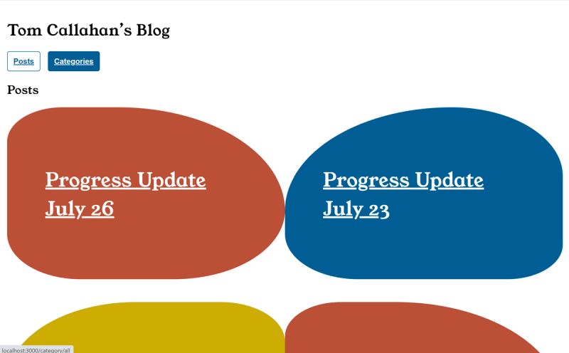
For now I'm implementing Young Serif and Inter. Here are the screenshots including a really rough initial color blob test: